
It would’ve been hard to miss the recent news that Absolut and Tabasco have joined forces. What’s more, seeing a premium Swedish vodka paired with a 150-year-old Louisiana hot sauce brand could easily have tipped into a gimmick.
Instead, the collaboration feels surprisingly natural. Launching across 50+ markets from February 2026, Absolut Tabasco is more than a flavour innovation responding to rising demand for spicy spirits. It’s a case study in how two brands with uncompromising visual codes can coexist on a single canvas without one overpowering the other.
Starting with taste
Elin Furelid, head of new product development at Absolut, explains how the creative process began not with form, but flavour.
“For us, it always starts with the taste experience,” she says. “The packaging has to reflect what’s inside, and Tabasco’s heat is so distinctive that it became our creative anchor.”
The vodka is crafted using a natural essence derived from the fermented red pepper mash used to make the sauce. That heat builds gradually, leaving a warm sensation rather than an aggressive burn. The design had to communicate intensity, but without clouding the crystal clarity Absolut is known for.

The solution sits on the reverse of the bottle in the form of a layered red screen-printed pattern, built from the sauce’s diamond device. Viewed from the front, it magnifies through the clear liquid, creating what Furelid describes as a glowing depth effect.
“It gives a sense of warmth and intensity without altering the liquid itself,” Elin adds. “The flavour and the pack evolved together.”
Protecting two sacred silhouettes
While flavour was the emotional starting point, brand codes were the non-negotiables.
Absolut’s apothecary-inspired bottle is among the most recognisable silhouettes in spirits. Tabasco’s diamond label, meanwhile, is one of the most distinctive devices in grocery. The risk of compromise was high.
Rather than blending the two identities into a hybrid, the team chose to let both remain intact.
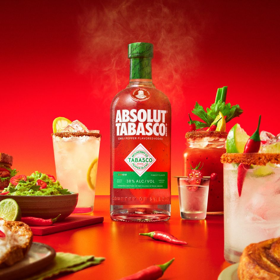
“Both brands already have very defined placement rules,” says Elin. “Absolut naturally lives in the upper half of the bottle, while Tabasco’s diamond sits confidently in the lower portion, just like on their original sauce bottle.”
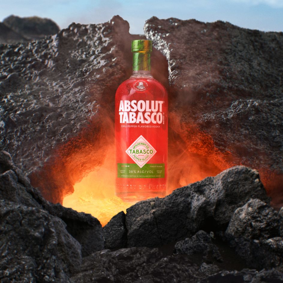
By keeping each brand in its familiar “home”, the hierarchy feels quite instinctive. Absolut’s white logotype anchors the upper half in Scandinavian restraint, while the diamond, framed in its signature red and green, grounds the lower half in Tabasco heritage.
It could’ve looked like a mash-up, but it’s actually more of a respectful cohabitation.
Shelf impact without structural change
With distribution planned across more than 50 markets, engineering considerations were just as critical as aesthetics.
“We kept our classic Absolut shape so the bottle runs on all existing lines globally,” Elin explains. “The real impact comes from the detailed screen-printing work.”
The printing was executed in two shades of red and layered to create depth, making it one of the most intricate designs the brand has undertaken. The effect is bold from a distance and complex up close, achieving shelf stand-out without resorting to unusual shapes or overt theatrics.
The spirits category is often tempted by sculptural novelties for limited editions, so the restraint in this collaboration feels deliberate.
Avoiding the gimmick trap
With a spicy vodka, it would have been easy to lean into literal sauce-bottle references, chilli motifs, and exaggerated graphics. Still, Furelid notes that they stayed away from anything gimmicky.
“No novelty bottle shapes, no literal sauce-bottle mimicry,” she says. “Both brands are too iconic to bend into something that feels like a novelty.”
Instead, the innovation lies in integration. This is the first time Absolut has co-created a flavour with another brand, rather than developing one independently.
The technical work behind capturing Tabasco’s genuine pepper mash heat while keeping the vodka smooth and sugar-free is complex, but the bottle doesn’t shout it. It lets craft do the talking.
A meeting of heritage and heat
There’s something fitting about this collaboration beyond the spice trend. Both brands are built on surprisingly simple ingredient stories: three natural components in Tabasco Sauce, and three in Absolut Vodka. Both trade on heritage, process and place.
In that sense, Absolut Tabasco isn’t about shock value. It’s about amplifying shared codes of clarity, authenticity, and boldness while pushing them just far enough into new territory.
The final bottle doesn’t distort either identity. Instead, it creates a visual tension between cool Scandinavian minimalism and fiery Louisiana flavour. The real design achievement is capturing heat, without losing composure.

